Saturday, January 29, 2011

“Beauty: Weekly Photography Challenge” plus 1 more: Digital Photography School

“Beauty: Weekly Photography Challenge” plus 1 more: Digital Photography School

Link to Digital Photography School

Beauty: Weekly Photography Challenge

Posted: 28 Jan 2011 10:00 AM PST

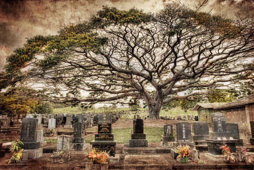
Image by FleeCircus

This week your challenge is to take and share a photograph with that fits into the theme of ‘Beauty’ (inspired by Monica Marinez on our Facebook page).

It’s a very broad theme and is one that is open to a lot of interpretation and creativity. Show us something that is beautiful to you, critique a ‘beautiful’ social norm, capture a beautiful landscape – the possibilities are endless – after all…. beauty is in the eye of the beholder (or beerholder as we used to say).

Once you’ve taken your ‘Beauty’ photos – choose your best 1-2, upload them to your favourite photo sharing site either share a link to them even better – embed them in the comments using the our new tool to do so.

If you tag your photos on Flickr, Twitter or other sites with Tagging tag them as #DPSBEAUTY to help others find them. Linking back to this page might also help others know what you’re doing so that they can share in the fun.

Also – don’t forget to check out some of the great shots posted in last weeks Windows challenge – there were some great shots submitted.

Post from: Digital Photography School


How To Apply Textures To Your Photographs

Posted: 28 Jan 2011 05:05 AM PST

Let me start off by saying that I don’t use textures all that often, but there are certainly times where I feel that an image could use just a little something extra. Textures are just another one of those things in digital photography that can be overused and overdone if you’re not careful, and there are certainly right and wrong ways of going about it.

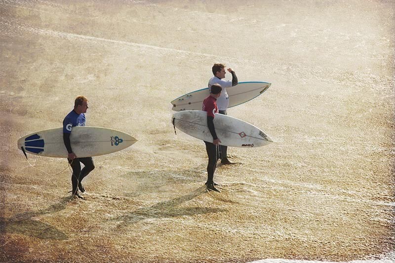
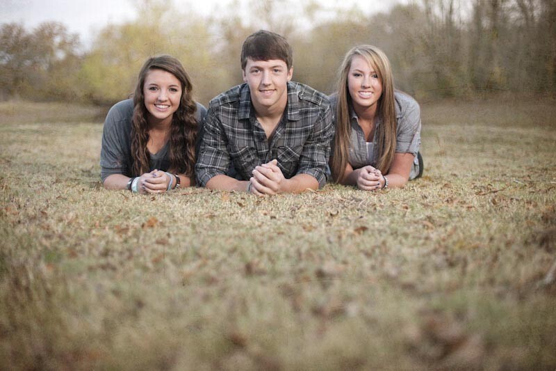
So, for those that have never heard of this before or have yet to try it, you may be wondering what it means to add a texture to a photograph? Simply put, it means taking one image (usually of some sort of texture like peeling paint, a scratched surface, a textured wall or fabric) and applying it as an overlay to your actual image. The effect is achieved by changing the blend mode of the texture in photoshop so that the texture actually becomes translucent and part of the actual image. For this tutorial, I’ll take a simple image I took in California during a surf competition, and add a texture to bring it to life.

Here’s the image straight out of the camera and the texture we will be using from my library…

If you’re new to Photoshop, you should make your number one priority this: Get familiar with layers and masks. Those are two key functions in Photoshop that I use every single time I’m in the program. Layers and masking (among other things) are what make Photoshop such an incredibly powerful program, and these foundational skills will take you a long way in learning the program. With layers, anything on the top layer has precedence over whatever is below it. Since I want to apply the texter to the image of the surfers, I need to place the texture as a layer above the surfers.

Note: Before we get into these screen captures, I know they may seem a little small and hard to read. To see more detail, I included larger versions as well. Just right click the image and view it in a new tab to see te full size version.

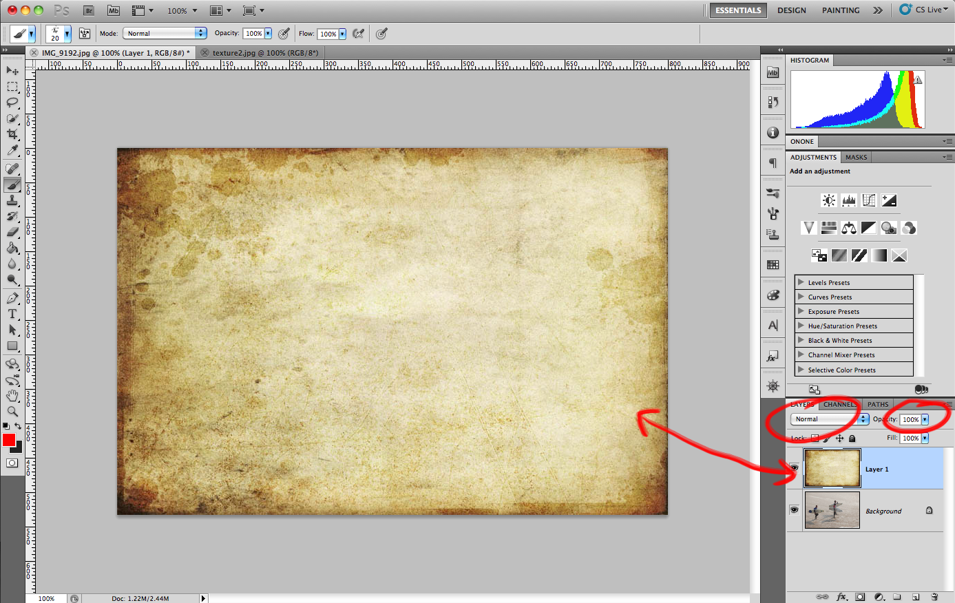
The first thing you should notice in the screen shot is that all we can see is the texture. That’s because the texture is on a layer of it’s own sitting above the image of the surfers, as seen on the bottom right of the screen. Another reason we can’t see the surfers yet is because the opacity of the texture is set to 100% and the blend mode is set to normal. Changing the blend mode of the texture will do something very different depending on what you choose. For textures, I typically stick with either “Overlay” or “Soft Light.” If I want the texture to be more dominant in the image, I’ll go with overlay. If I want a more subtle texture, I’ll go with soft light.

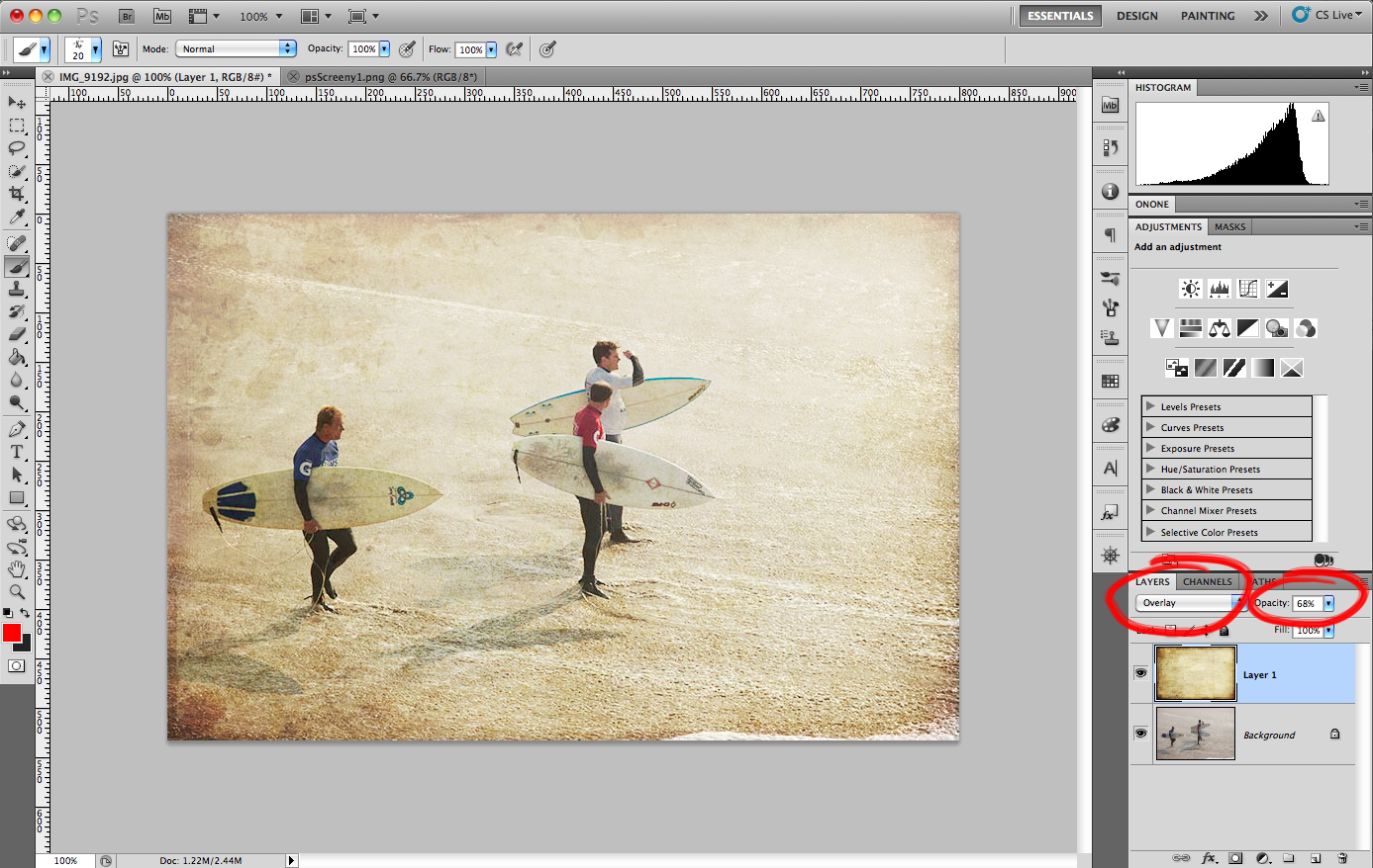
Opacity is another very useful tool at our disposal. Adjusting this slider is just one more way to affect the outcome of how the texture will look. If setting it to overlay looks too strong, but soft light looks to weak, just set the blend mode to overlay and adjust the opacity of the layer down until it look right.

See how easy that was!? For this image, I changed the blend mode to Overlay and pulled the opacity slider down to 68%. Why 68%? No reason really, I just adjusted the slider up and down until it looked right to me, and that happened to be at 68%. We’re almost done with this image, there’s just one problem left: The surfers. Now we have a texture overlay laying on top of the surfers skin and clothing, and that just will not do. For an image like this it might not be as noticeable, but try adding a texture to a portrait and you’ll see what  I mean. While this is a problem, there’s an easy solution, and that solution is masking.

Masking in photoshop is an incredible tool and will literally blow your mind when you “get it.” For some, masking is a hard concept to get the hang of, and it takes time to really understand how to do it. Because I was like this in the beginning, I will try and be as clear as possible about what masking is.

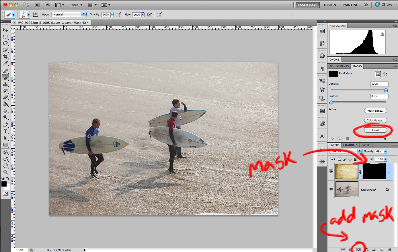
Applying a mask to a layer means that you want to either conceal or reveal parts of that same layer. There are only two types of masks; black and white. A good phrase to remember is, “Black conceals and white reveals.” If I place a white mask over the texture layer, nothing will happen, because white reveals whatever layer it is on. If I place a black mask over the texture layer, the texture will disappear because black conceals everything on that layer.

In this screen shot, I added a black mask just to show what it does. For the actual image I will use a white mask. To apply a layer mask, just highlight the layer you want to use and click the tiny little mask icon at the bottom right of the screen. By default, the mask will be white. If you want to add a black mask instead, there a few ways to do it. First, you can hold down the Option button on your keyboard while you click the add mask icon. Or, you can add the layer mask as white, then click “Invert” on the right hand menu (circled). Another quick way is to add a white layer mask, then hit the shortcut “Command I” to invert to a black mask. All three options get you the same result.

So, I mentioned that I will use a white mask for this image. Because white reveals everything on the texture layer, I need to add some black to the mask to conceal certain parts of the texture. I want to hide the texture so it doesn’t show up on the surfers, but keep the texture visible on the rest of the image.

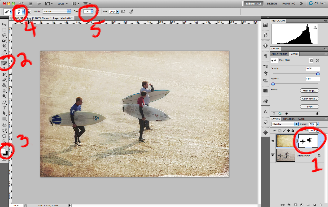
I numbered this one because it jumps around the page a bit. This image is pretty much done, so let’s go over what we did with the mask here…

  1. As you can see, I used a white layer mask on the same layer as the texture. Therefore, if I add any black to that mask, it will conceal the texture and let us see anything beneath it. If you look at the layer mask, you will see that I painted in an outline of each surfer into the image.
  2. With the layer mask selected (be sure the layer mask is selected, not that texture!) select the Brush tool from the left side or hit the B key as a shortcut. The brush is what we will use to paint in the surfers to the mask.
  3. If you’re using a white mask you want to paint with black, if you’re using a black mask then you paint with white. If you have different colors on your swatches here, then make sure your mask is selected and not the texture. When you highlight a mask, your swatches will switch to black and white by default. Whichever color is on top is the one you will be painting with so make sure black is on top (unlike the screenshot). To switch between black and white, just hit “X” on the keyboard.
  4. Most of the time, you want to paint with a soft brush. Click the icon circled and adjust the brush to a soft tip. This will make the strokes more subtle and pleasing to the eye.
  5. Finally, changing the opacity is usually a good idea too. Painting at 100% opacity will make your brush strokes very obvious and it will look bad. Instead, adjust your opacity by using the slider or by hitting a number key on the keyboard. Hitting “1″ will give you 10% opacity, hitting “9″ will give you 90% and so on. I usually use a 50% brush but it just depends on the image. In this one I used 70%.

That’s it! Here’s the final image…

More Examples of Textures

Conclusion

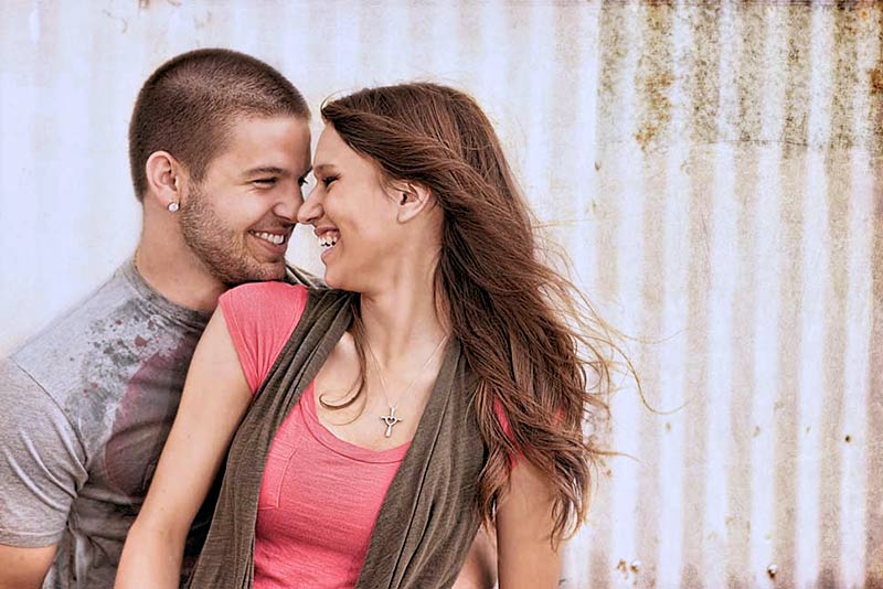
Once you learn layers and masking, applying textures is a breeze. It’s important to know what type of image will work well with a texture and which images won’t. This will come with time, but just know that not every image needs it! It’s important not to overuse them on an image, as they are meant to compliment the image and not dominate it (in most cases that is).

Be sure to let us know what you think in the comment section below. If you used this tutorial and gave it a shot, show us your work by including a link to your image!

As always, be sure to follow me on twitter (@jamesdbrandon) if you don’t already. I’m always available there to answer questions as well and I do my best to share the work of others for inspiration.

Post from: Digital Photography School


Friday, January 28, 2011

“Using Lightroom’s ‘edit in photoshop’ feature” plus 1 more: Digital Photography School

“Using Lightroom’s ‘edit in photoshop’ feature” plus 1 more: Digital Photography School

Link to Digital Photography School

Using Lightroom’s ‘edit in photoshop’ feature

Posted: 27 Jan 2011 11:03 AM PST

I think my heart must’ve skipped a little beat when I happened to catch that ‘edit in > photoshop’ option when I was first getting to know and love Lightroom. This was also the same time at which I was falling in love with layer editing, applying textures and other ways to fab up your photos in Photoshop. And even though LR doesn’t have all the capabilities of PS, you can have the best of both worlds with this feature.

There’s a video below to actually show you how to use ‘edit in photoshop’ in LR3, but if you’re already pretty sure about what you’re doing in LR, here are the steps:

  1. Right click on your image and select ‘edit in > photoshop’. It will allow you to select from whatever PS version(s) you have installed, for example mine lets me choose PS4 or PSE.
  2. Your image will open in Photoshop. Now, these are very speed/space hogging programs. Your computer might not be configured to run both programs side-by-side but give it a go and see what happens!
  3. Edit away. When you’re done, just click ’save’ and then when you toggle back to LR, it’ll be there!

Note: I’ve experimented a bit to see if there’s a way to do this and save on space by closing down LR as soon as the image opens in PS. It seems that you have to actually have both programs running side-by-side for the image to pop up when you toggle back into LR after the edit.


Post from: Digital Photography School


Adding Emotion and Feeling To Photographs

Posted: 27 Jan 2011 05:08 AM PST

One thing that makes a great photo is its ability to convey emotion. Emotion in a photograph, or any work of art, is what helps a viewer connect with a piece if that emotion is prevalent in the viewer. Happiness and joy, sorrow and despair, these are some of the easier emotions as they are universally felt, at one time or another, by all on this planet.

Emotion, or a feeling, is what can bring a snapshot out of obscurity and make it shine. Think of a normal sunset picture from the shores of Hawaii with just the horizon and a bright orange sun dipping low. It’s beautiful for sure and even better when viewed in person. Now pull the zoom back to a wider angle and show a couple in silhouette, sitting on lounge chairs facing the waves and reaching to each other to hold hands. Different people will connect with each photo in different ways, or maybe not at all. Those in a romanic mood will enjoy the photo of the couple and those looking for calm without distraction may enjoy the singular sunset.

My point here is you can’t guess which mood people will be in when they view your work. Which is actually a good thing, because the photo should be your expression of what you see and feel through the viewfinder (unless you are attempting a neutrally biased photojournalistic stance). Here then are some tips to help convey emotion and feeling in photographs to help make a stronger connection with viewers.

Realize What Type Of Mood You’re In While Shooting

Your emotional state has the largest impact on the emotional quality of your photos. When I look back through travel photos I will often noticed a dip here and there in the number of photos taken on a particular day. The quality is also off and I can remember just what I was feeling that day. In most cases, I had that, "Just not feeling it today" blah that comes and goes for us all. And it shows in my work. Ok snapshots of mountains, but nothing to write home about.

Other days I feel like the world is my oyster and I’m uncovering hidden gems left and right.

It’s important to understand where you are and realize that will likely come through in your photography (while realizing just like anything in life, some people are really good at faking it). Give yourself a break on the down days and be sure to pick up your camera on the upswings. Just remember that neither lasts forever.

Tighten The Shot

Often a singular emotion gets lost in a busy scene. This goes for photos as well. Simplify the main subject of the image before hitting the shutter release. A wide angle view of a festival in the streets might show the size, which can be impressive in its own right, but the feel of that party is best conveyed on the faces of those dancing or performing in the crowd. Zero in on the action. It may tell the difference between a large crowd who is standing around, bored or a large crowd having the time of their lives.

Focus On Faces

This is a fairly straight forward bit of advice that may seem obvious, but many of us avoid people photographs when in a new situations with strangers. When possible, always ask permission before taking a picture of stranger, especially head on. Again, remember your mood will possibly influence theirs and if you are trying to capture them as naturally as can be (without being a sniper hiding in the shadows), keep your demeanor as neutral as can be. Simple raised eyebrows while pointing to your camera does work and it doesn’t require a huge smile on your part, as if you are asking your subject to smile back.

Chances are they will convey what they wish. If life is hard, they likely won’t smile and their face will often tell the tale of their hardships. If they are joyous, or just young, you may get a beaming smile. And with any good portrait, remember to get sharp focus on the eyes.  And share the results with your subject if you can.

Set Your Camera Down And Observe

I tend to get lambasted when I tell people to stop shooting and set the camera away, so this time I’ll simply tell you to put the camera down for a minute. Forget about shooting and just sit and observe. Your mood has a big part in what and how you shoot, but also realize that being a shooter in a situation often means you travel in a bubble.

To break out of that bubble and absorb more from the world in which you are immersed, sit. And observe for 15 minutes. The mood of those around you will often become more apparent with this relaxed stance.

Return If You Can

If you are shooting a subject which you can return to, do it. The same street or beach or room will have a different feel on different days, especially if the weather changes often. And your mood can shift as well from day to day. Return to a location with an open mind for a second look and you may be surprised to find not only are the characters involved different, the feel of the place is different too.

Conveying emotion in photography is a surefire way to help your work connect with those viewing it. It will help lift the quality of your work and give it more punch. Before you hit the shutter release next time, think to yourself, "What emotion am I trying to convey?"

Post from: Digital Photography School


Thursday, January 27, 2011

“Black and white in Lightroom” plus 1 more: Digital Photography School

“Black and white in Lightroom” plus 1 more: Digital Photography School

Link to Digital Photography School

Black and white in Lightroom

Posted: 26 Jan 2011 11:07 AM PST

opener.jpg

Most of us know we can convert and image to black and white in Lightroom by simply pressing the letter V. However, for the exact same image, your version of Lightroom might give a very different result to my version of Lightroom. The explanation is that there are two settings available for black and white conversions in Lightroom.

I'll show you what these are, how to configure the one you want to use and how to quickly switch between them.

Lightroom_black_and_white_step1.jpg

With a color image on the screen in Lightroom's Develop module, press the letter V to convert it to black and white.

Open the B&W panel – it's called Greyscale in Lightroom 2 – and check out the color sliders.

Lightroom_black_and_white_step1a.jpg

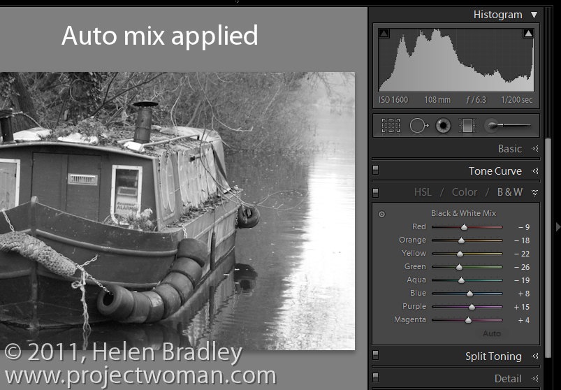
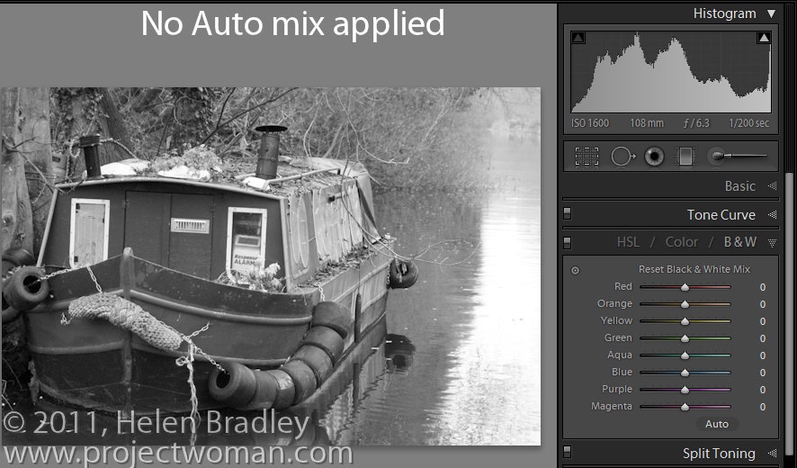
Depending on the preferences that you have set, the sliders might all be set to zero or they might show a black and white adjustment tailored to the image itself which Lightroom calls Auto mix.

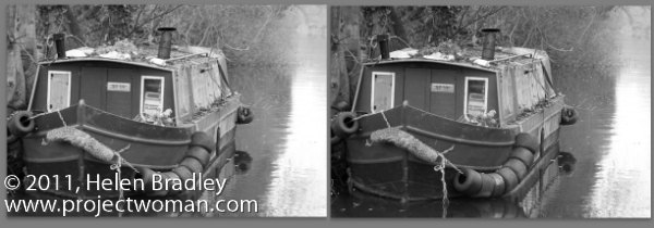
The auto mix adjustment applies an auto exposure adjustment to the image as well as a conversion that maximizes the distribution of the grey tones in the image. This is customized for the image so every image will be given a custom adjustment much as you will get if you click the Auto Tone button in the Basic panel. Notice the subtle differences in the histograms in each of the adjustments here.

Lightroom_black_and_white_step2.jpg

Whether or not you see this Auto mix applied to a black and white image is controlled by your Lightroom preferences. To see these, choose Edit > Preferences (or Lightroom > Preferences on the Mac), select the Presets tab and there's an option there which reads "Apply auto tone mix when first converting to black and white".

If this is checked you will get the auto tone mix applied to the image, if not, you will see a black and white adjustment where each color is given the same adjustment value of zero.

Lightroom_black_and_white_step3.jpg

Regardless of which setting is in place you can switch between the two in the B&W panel.

If an Auto mix has been applied, hold the Alt key (Option on the Mac) and you will see an option Reset Black and White Mix. Click this and all the sliders will be set back to zero.

Lightroom_black_and_white_step4.jpg

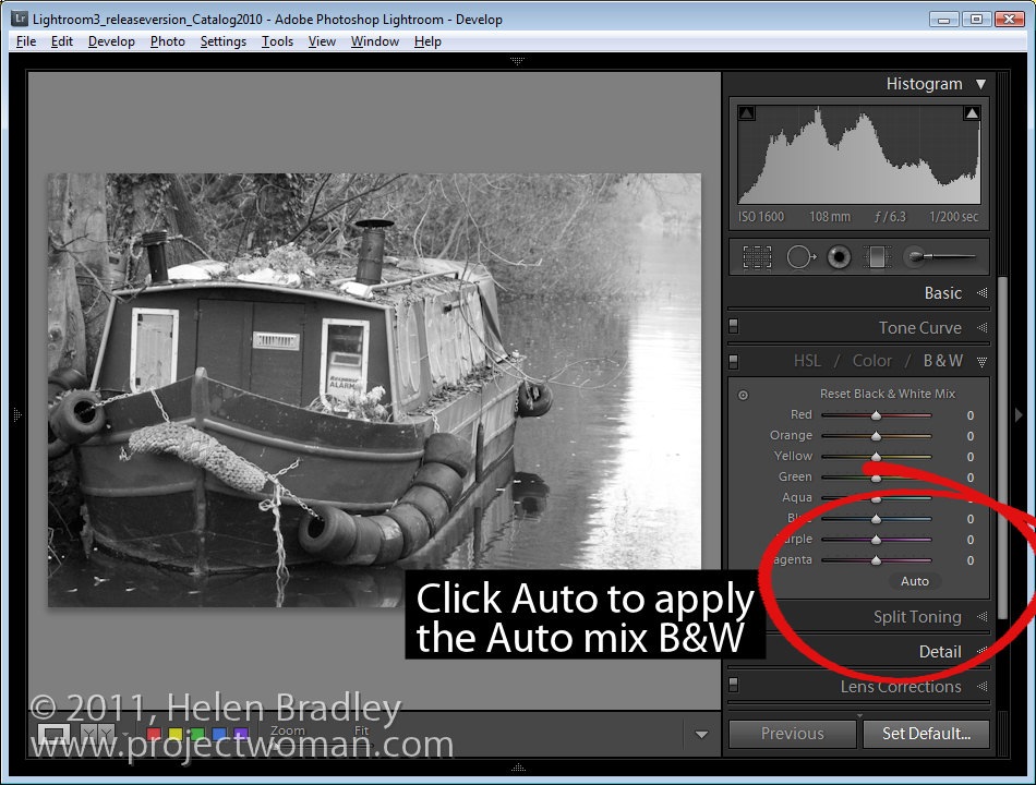
On the other hand, if your sliders are all set at zero, click Auto to apply the auto mix adjustment to the black and white image.

Lightroom_black_and_white_step5.jpg

You can further adjust the black and white regardless of whether you have an auto mix applied automatically to it or not by adjusting the sliders.

You can also select the Target Adjustment Tool and drag on an area of the image to adjust whether it is light or dark. Dragging downwards will darken it, dragging upwards will lighten it.

Post from: Digital Photography School


Photo Nuts and Shots: Tools and Techniques for Creative Photography [Our New eBook]

Posted: 26 Jan 2011 05:01 AM PST

You can use a camera … but do you take great photos?

  • The dream – taking photographs that your friends think you paid someone for, not shot yourself.
  • The myth – that you just don’t have what it takes. You need better gear, you don’t have ‘the eye’ and you’ll never understand the skills needed to take amazing photos.
  • The reality – Great photography CAN be learned.  This book is the perfect companion on your journey to becoming a photographer.  It will teach you the techniques, tools, and thought processes used by the pros to take gorgeous photos. If you think creative photography is limited to those artistic types – think again.

Become a better photographer with Photo Nuts and Shots.

This lush, 100+ page pdf ebook is the ultimate creative photography primer – and for a limited time you can grab your copy for 25% off!

Here’s a little video we made about this new eBook (note: the guarantee is 60 days not 30 as it says in the video).

Download-it-Now---Shots.jpg

Photo Nuts and Shots is perfect if you …

  • look at others’ images and wonder “Why don’t my photos look like that?”
  • want to take gorgeous shots, every single time
  • know your camera, but want to learn the craft of photography
  • long to take more emotive, expressive photos
  • want to take photos that truly connect with viewers.

What You'll Learn

Packed with all-new, practical advice from professional photographer Neil Creek, Photo Nuts and Shots has been developed specifically for DPS readers.

  • Learn to harness light to convey emotion.
  • Understand the rules of composition … and know when to break them.
  • Take the sharpest possible photo every time.
  • Learn to adapt the camera’s exposure to produce the shot you want.
  • Master the concepts of shot perception, planning, and execution — in any setting.
  • Tap into your unique creativity to take evocative photographs that reach out to viewers.

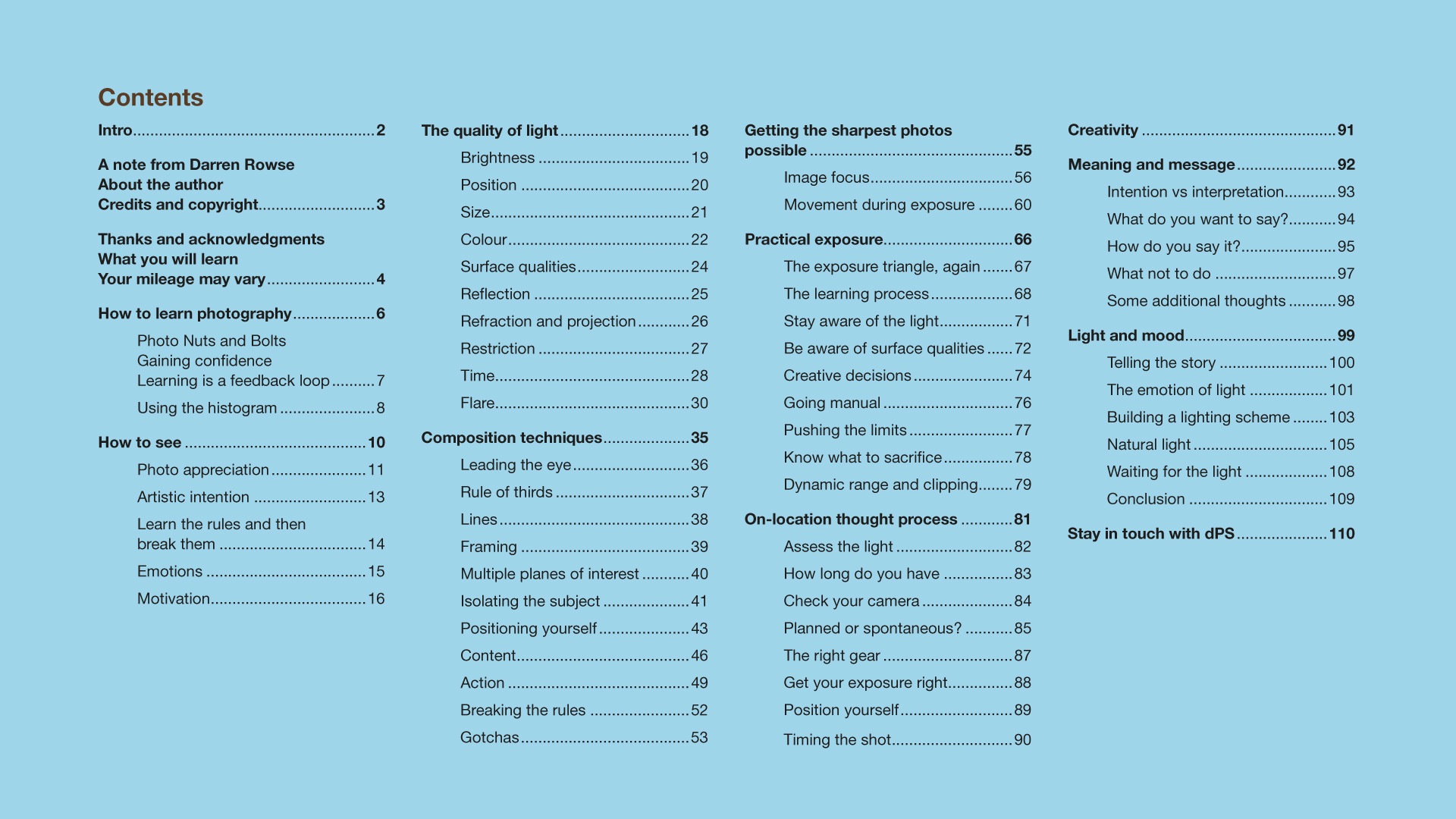
Contents page.jpg

Why do we think this is the best creative photography guide on the market?

  • Because it's comprehensive: over 100 pages of all-new content.
  • Because it'll improve your photography, starting today: Neil's advice is immediately actionable. Whether you read the whole book from cover to cover, or take snippets from the areas that interest you, you'll see an immediate improvement in the quality of your images.
  • Because it shows you how to harness your creativity: use your creative instinct to select and apply practical techniques that create stunning shots.
  • Because it builds on your existing technical knowledge: whether or not you've read Photo Nuts and Bolts, the first book in the series, this practical primer builds on your existing knowledge of your camera with in-depth advice, practical examples, and a wealth of illustrations.
  • Because it will help you be a better photographer: this inspiring guide explores rarely-discussed topics to help you tap into your creative drive, empowering you to be the best photographer that you can be.

page-fan.jpeg

Early Bird Special: Secure Your Copy for 25% Off

This lush, inspiring, practical guide normally retails for $19.99 but as a launch special and for a limited time, you can secure a copy for just $14.99.

This 25% off special is for two weeks only – so don’t delay.

Order Today and Go in the Draw to Win a Canon DSLR

What better way to put into practice what you learn in the eBook than to do it with a brand new camera!

To celebrate the launch of Photo Nuts and Shots we are giving one buyer this eBook a brand new Canon EOS Rebel T2i 18 megapixel DSLR complete with an 18-55mm lens. This bundle is worth over $800!

To be in the running to win this best selling camera simply purchase your copy of Photo Nuts and Shots before midnight (Eastern US time) on Wednesday 2nd February and you’ll automatically be entered into the draw to win.

60-Day, Money-back Guarantee

If you're not satisfied that Photo Nuts and Shots is helping your photography within 60 days, just let us know and we'll refund your money

That's how confident we are that this resource will help you become the creative photographer you want to be.

Download Your PDF Copy Today – 25% OFF!

Photo Nuts and Shots is ready for your download right now for just $14.99 USD – to secure your copy simply click the 'download it now' button below and you'll be taken to a page where you can make your payment via PayPal or Credit card and get immediate access for download.

Download-it-Now---Shots.jpg

Post from: Digital Photography School