“Using Canon’s Picture Styles” plus 1 more: Digital Photography School |  |

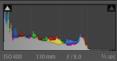
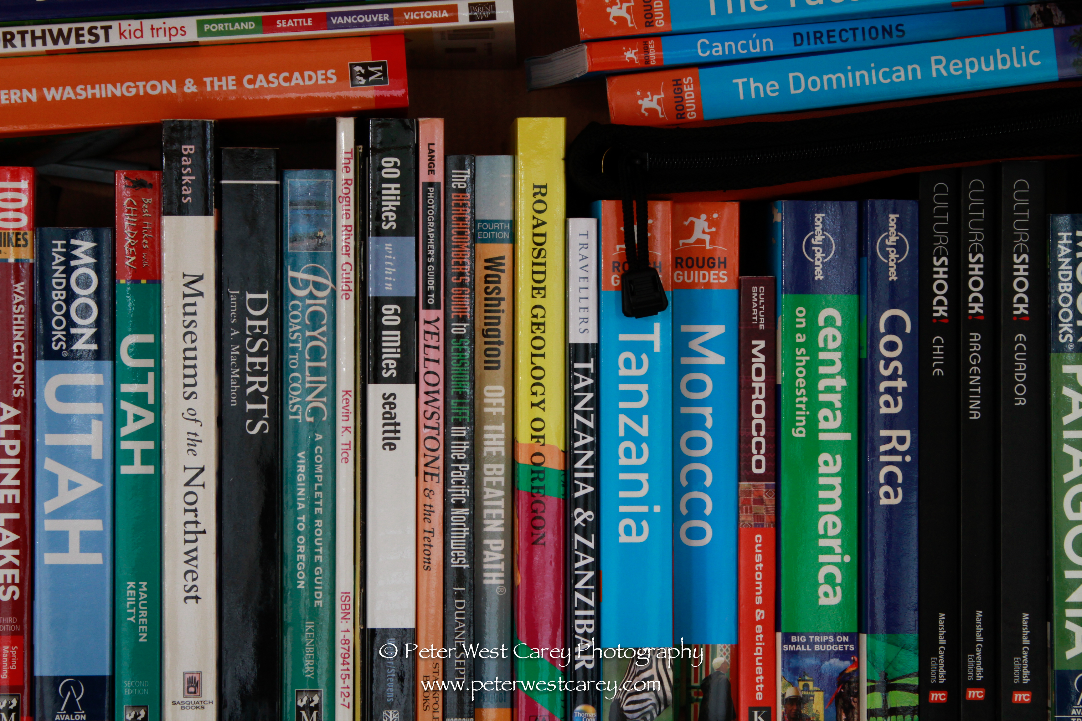
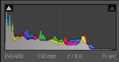
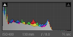
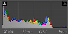
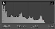
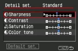
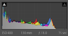
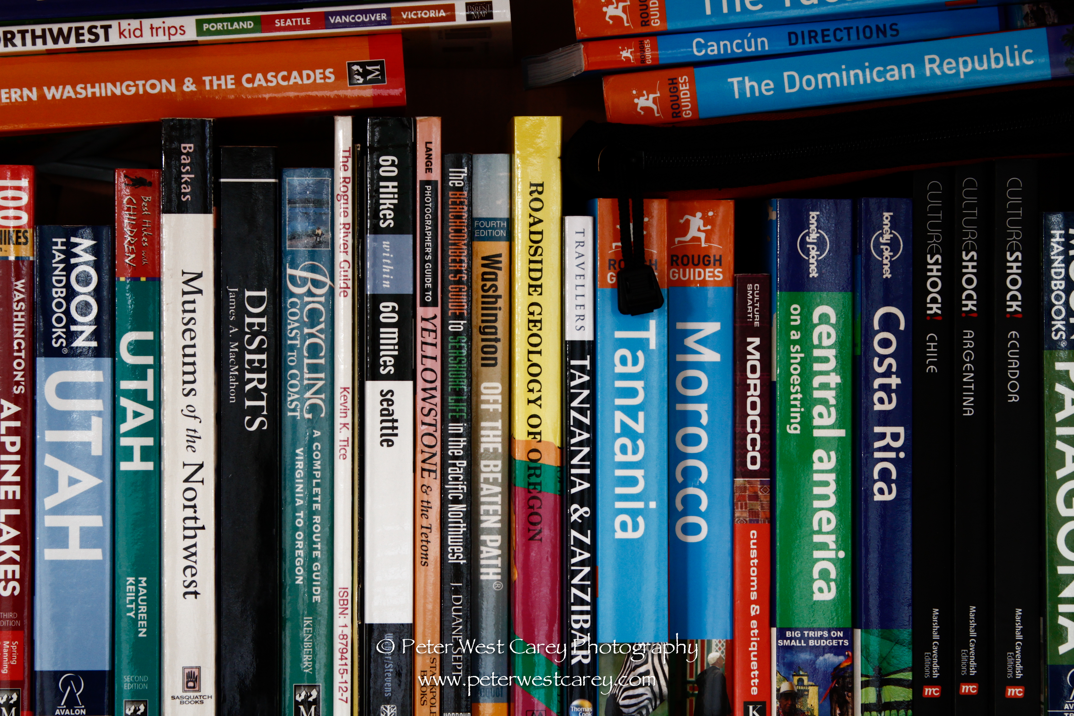
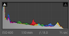
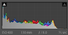
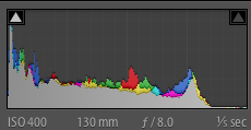
| Posted: 25 Jan 2011 11:15 AM PST I’ll admit that today was the day I picked up the manual for my camera. I have done it once before but today I got very curious just what the Picture Styles feature on a lot of Canon DSLRs actually does. For the most part I shoot in RAW and it has no impact there. It is only set to make changes to JPEG images produced by the camera. But what real affect do the various settings like Standard, Portrait and, more so, the custom adjustments I can make, have on the final image if I want quick, out of the camera punch or neutral rendition? One note: A wide range of possibilities opens up to adjust Picture Styles on RAW images in programs like Canon’s Digital Photo Professional (DPP) software or BreezeBrowser, and that is a whole other ball of wax for another post. Let’s take a look at the settings themselves first. This information is from a Canon 7D but is relevant to most of the DLSR line with the Picture Styles settings. From the left, those symbols represent the setting for Sharpness, Contrast, Saturation and Color Tone (Hue). All in this image have a setting of zero next to them. I’ll be using those settings in that order for the remainder on this post: Sharpness, Contrast, Saturation and Color Tone. Now then, there are six preset modes: Standard, Portrait, Landscape, Neutral, Faithful and Monochrome (followed by Custom1, 2 and 3 in the image below). I will begin by showing representations of each of these settings and then dive into customization of just Standard mode. Otherwise this post would be filled with more than 50 screen shots and become confusing. All photos are shot at ISO 400, 130mm (28-300mm L lens), 1/5 and f/8.0. The images were given a small 1/3 of a stop bump in exposure. Click on an image for a larger version. StandardSharpness: 3 Contrast: 0 Saturation: 0 Color Tone: 0 PortraitSharpness: 2 Contrast: 0 Saturation: 0 Color Tone: 0 LandscapeSharpness: 4 Contrast: 0 Saturation: 0 Color Tone: 0 NeutralSharpness: 0 Contrast: 0 Saturation: 0 Color Tone: 0 FaithfulSharpness: 0 Contrast: 0 Saturation: 0 Color Tone: 0 MonochromeSharpness: 3 Contrast: 0 Filtering Effect: none Toning Effect: none Each of the modes has a specific intent. Standard is set to give a lively view and a likely rendition that will appeal to most viewers. Portrait softens the sharpness while highlighting skin tones. Landscape will increase sharpness and increase saturation slightly, especially in greens and blues. Neutral attempts to make as little change as possible to make post processing easier. Faithful takes this a step further and attempts to render colors as if under a 5200K light source. Monochrome opens up the possiblity of using Filtering Effects (Yellow, Orange, Red, Green) and Toning Effects (Sepia, Blue, Purple, Green) In this tutorial, I will use the Standard mode from which to start making adjustments. These adjustments are reached by hitting the Menu button and then finding and selecting the Picture Style item. The default settings for Standard are then shown with an option to make adjustments using the selection wheel or pointer.
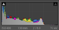
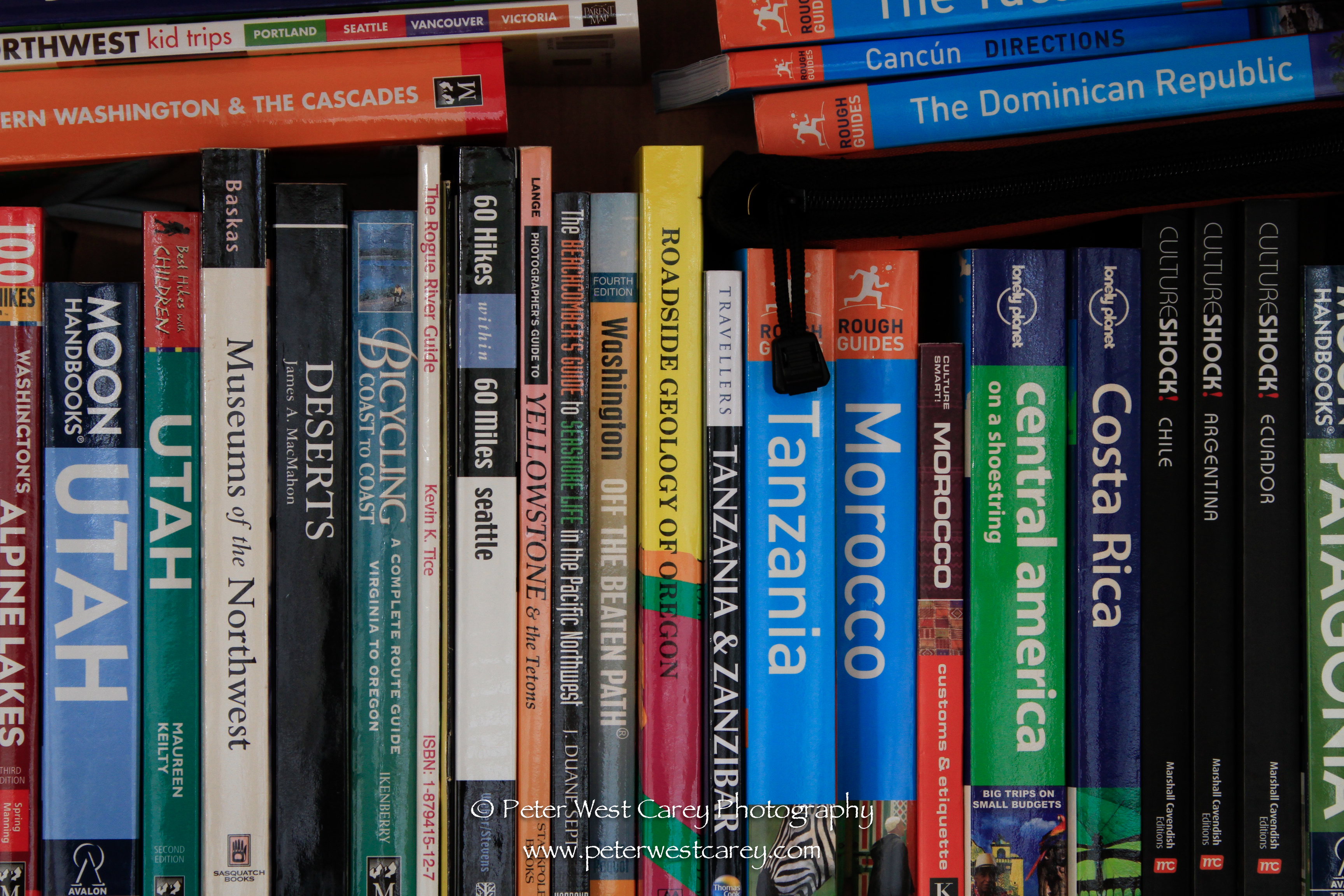
Notice in the histogram the peaks are far more pronounced. Next, the Sharpness is returned to the Standard setting of +3 and Contrast is taken to +4, followed by Contrast at -4. Again, check the histograms for minor changes. Returning Contrast to 0, it’s time to give Saturation a whirl. First +4 then -4. Here again, there is a wide range of effect which can be applied depending on your liking. Lastly, Saturation is returned to 0 and Color Tone is given a swing from +4 to -4. From here, each of the Modes has their own set of adjustments you can make with over 4,000 different possible combination (except for Monochrome, which is slightly less)! If you want to get a hands on feel for making adjustments to the sliders but just happen to be at work reading this and you camera is no where to be found, Canon has a web page devoted to allowing free play of the settings. If you regularly shoot in JPEG mode, play around with the settings and find a look that works for you. Most Canon cameras have the option to save these custom settings as one of three presets, perfect for a quick switch when the situation arises. Post from: Digital Photography School
    |
| Instagr.am – iPhone Photo Sharing Application [Review] Posted: 25 Jan 2011 05:24 AM PST My first Upload Lately I’ve been using the Instagr.am App on my iPhone and it has been a lot of fun. In this post I’m going to briefly share some reasons why I’m enjoying using it and talk a little about my Instagr.am workflow. But before I get into that:
OK – with that said…. I first got onto Instagram just a couple of weeks ago. I think I’d originally seen it starting to appear in some of the facebook and Twitter streams of friends who were using it to share photos. At first I didn’t think much of it and threw it in the ‘just another social media photo sharing app’ basket – but after seeing more than a few people I respected using it I decided to check it out for myself. The fact that it’s a free iPhone app made checking it out just that little bit more attractive! So at it’s core Instagram is very simple. In fact it’s been critiqued by some as being too simple and there are some features I’d love to see them add (although it only launched in October so I guess their still really in the early stages of refining it). Here’s how the team at Instagram describe what they’ve developed:
At present the interface lets you either take pictures from within it or pull images in from your iPhone camera roll. The only way you can add photos is via your phone (to bring them in from another camera means importing them into your iPhone and then uploading them – which some people do).  Adding Filters is Easy The filters Instagram offers currently number 11. They’re mainly fair ‘retro’ kinds of filters that add borders, textures and change colors. There is no real way to control how much a filter is added to your image – it’s all or nothing. However you can always do post production work in other apps and then save them to your camera roll to upload them (I’ll touch on this later). Once you’ve got an image ready to share you can simply add it to your feed or have the opportunity to also share it in other social media tools. Currently you can share it to Twitter, Facebook, Flickr and Foursquare. There’s also the ability for others to view your images from within the app on their iPhone. You can invite and find friends and anyone who accepts your friendship will see your images in their feed. Images can be ‘liked’ and commented upon by others giving you feedback on how your images are being received. Popular images are also featured in a ‘popular’ tab in the app so you can see what everyone else is liking. A Limitation I hope they FixOne aspect that I don’t like about Instagram (and this has been a common complaint that I see others making) is that there’s no real web interface for it. When you share a link you are sharing a link to an actual page on Instagram (here’s an example of one of my recent images) – however when others visit that page they can’t do anything there. There’s no ability for anyone to ‘like’ or ‘comment’ on an image from the web page. You also can’t use their website to view all of the other images of the photographer or add them to your network. To do all of that you need to have the iPhone app which doesn’t make it very interactive for non iPhone users). Being able to point people at your own Instagram account where all your photos are kept would not only help you share your photography better but would also help Instagram to grow as people would be linking to it like crazy from their blogs and social networking profiles. Why I like Instagram Imported from my Computer/dSLR While there are some definite limitations with this app that I hope will be developed moving forward (either by Instagram or by others as they release their API) I’ve actually found it to be an application I’ve used numerous times per day. There are a number of reasons I find myself drawn to it:
 Popular Area - Be Inspired by Others My Workflow 3 Images in 1 - Created in the iPhone with the Diptic App One of the other things that I’ve been enjoying about Instagram is exploring some of the other iPhone photography apps that I’d not really been into before. As Instagram only really gives you 11 options for post production filters I have started to explore what other applications offer. As mentioned above the workflow for doing this is to:
Apps that I’ve been finding myself using to do this include:
I’m sure there are plenty of other iPhone apps that people will also recommend (feel free to add them in comments below). Another workflow that others use is to import images that have already had their post production work or images taken with other cameras from a computer into an iphone. It might seem a little bizarre that people would go to this effort (and I haven’t) but looking at some of the images that make it into the ‘popular’ tab it is clear that not all images being shared are taken on an iPhone. An App with PromiseInstagram has had a lot of press in the last months from around the Social Media blogosphere and deservedly so. It’s simplicity is great, it’s social/community feel is very positive and it does help people with the most common type of camera going around (that in the most popular type of phone going around) express themselves and share their images in a fun way. The fact that a month ago they already had over a million users says something in itself! It’s something I’m going to continue to play with and I look forward to connecting with you on Instagram if you do too – don’t forget to add me as a friend at ‘darrenrowse’. Post from: Digital Photography School
  |


| You are subscribed to email updates from Digital Photography School To stop receiving these emails, you may unsubscribe now. | Email delivery powered by Google |
| Google Inc., 20 West Kinzie, Chicago IL USA 60610 | |